In today’s edition of Sunday Skills I am delighted to share with you an article that was originally published on the excellent blog from Cole Nussbaumer, Storytelling with Data.
“How to do it in Excel” will show you step by step how to move from the traditional, boring line graph to one that is visually appealing and conveys the one point that you want to highlight. This is especially useful in Compensation & Benefits and for presenting any other trend data in HR. Of course it applies – after all, Cole is a Manager on the People Analytics team at Google – and who could say that Google is not good at understanding data and making the best use of it, whether for its people or for its business ?
So without further ado, here it is :
How to do it in Excel
One common piece of feedback I get after presenting on the topic of data visualization goes something like this: Wow, that was super useful. I’m never going to use pie charts again. But when it comes to the graphs, how do you actually make them look like that? I’m not Excel-savvy…help!
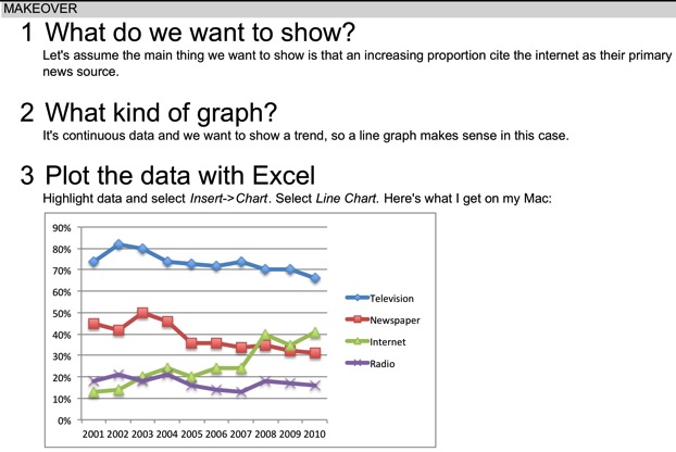
Pretty much everything I do is in Excel. I like to refer to it as “brute-force” Excel, because in many cases the graphing application doesn’t make it so straightforward to get from plotting the data to the final product. So I thought I’d take a few minutes to walk step by step through an example to expose those who question their Excel expertise to some of my tricks.
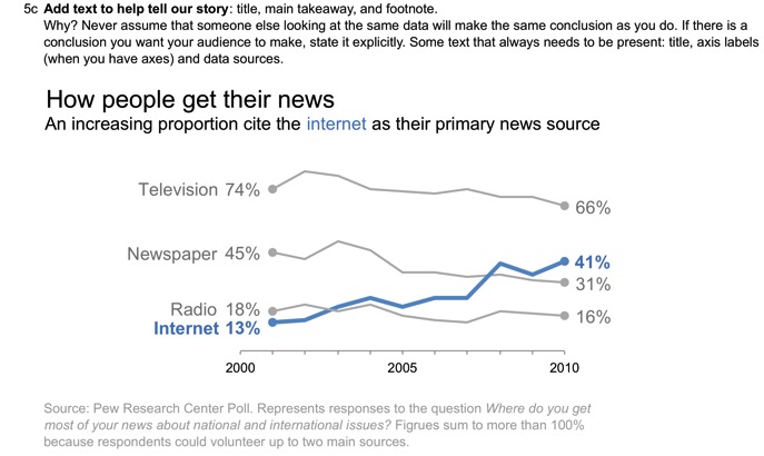
The following example may look familiar; it’s from the FlowingData Challenge earlier this year (original blog post here).
Note: I haven’t found an eloquent way to upload the full spreadsheet to Blogger (it may be that there isn’t one and the formatting goes crazy when I try to upload to Google Docs), but if you’d like the full spreadsheet, feel free to email me at cole.nussbaumer@gmail.com and I’ll send it to you.


Cole’s bio :
Cole Nussbaumer works at Google as a manager on the People Analytics team, which uses a data-driven approach to ensure that Google attracts and retains great people and that the organization is best aligned to meet business needs. Cole specializes in the effective display of quantitative information and has travelled to Google offices around the world to teach her course on data visualization.
Analyzing data in order to provide insight and drive action has been a common thread throughout Cole’s varied career. Prior to joining Google, she worked on several credit and repurchase risk projects with Cerberus Capital Management, coaching executive management on interpretation of projections and analyses. Before that, Cole managed operational risk and fraud management at Washington Mutual in Seattle.
Cole has a BS in Applied Math and an MBA with focus in quantitative methods, both from the University of Washington. When she isn’t working hard as a Googler or on her consulting work with Storytelling with Data (www.storytellingwithdata.com)
Liked this post ? Why don’t you share it on LinkedIn or Facebook ? Simply click on the link below and help your friends and connections benefit from it too !
Related posts :
- How to use Vlookup in Excel
- How to use Concatenate in Excel
- How to use Text to columns in Excel
- Even pictures have fine print


[…] Nussbaum does it once again ! After her post on How to do it in Excel which I re-published recently, she writes another excellent piece which compensation managers can […]